

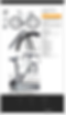
Plenty of bikes
UI / UX Case Study
Proposed Re-Design of target pages in functionality for a mid-scale cycling company with a target goal to generate more potential customers.
01
About Plenty of Bikes
Plenty of Bikes was founded and operated by a fellow cyclist and hobbyist, Jon Choy in Long Beach, CA. At first servicing the local community in vintage 10-speed restorations, but now have gradually grown to a fully service and special order bicycle shop carrying a variety of brands. The company launched it’s website and shortly after, it was found to reach a bigger spectrum of audience rather than only local consumers.
Redesign Intro
I decided to take on this project as a means to clarify the products offered by Plenty of Bikes along with creating a clean UI to demonstrate that purpose. Users should be able to find what they are looking for within filters to narrow down their searches while being able to navigate a clean, minimalist approach to the traditional complex e-commerce style sites.
Problem
The original website and template was originally designed focusing on returning users rather than new users. Primary elements such as information displayed on the page gave users a sense of being overwhelmed. Images were not consistent across the platform along with the ability to check how much stock is available whether from the site or in store.
Goals & Tasks
The primary goals of this project is to simplify the visual and information hierarchy that were displayed on any pages where there is a need for user engagement. While at the same time, rework the SEO structure that would drive more traffic and ultimately, turning users into a conversion or an acquisitions.

02
Design Guide
03
Wireframe
Laying out a general structure to how images and banners would be placed was essential to the planning and early process of developing the visual aspect of the Plenty of Bikes website landing pages and product pages.
Laying out a general structure to how images and banners would be placed was essential to the planning and early process of developing the visual aspect of the Plenty of Bikes website landing pages and product pages.

04
Moodboard
Determing a general color palette I decided to categorize the feel of the site using specific tones representing the sport’s primary season of activity being summer. I chose primarily warmer tones evoking sunset and sunrise as a more welcoming shade of tones to represent the cycling sport.


As bright tones are important to catching user attention, we wanted to make sure it was a tone that emitted the season of which the sport is engaged in.

Call to action was necessary to fit within the same color scheme with bright tones against dark to clearly define what is intended to be clicked on next.
05
Logo & Branding

The foundation for the logo was based primarily on the notion of a 9 speed gearing surrounding the company name. As Plenty of Bikes came primarily from fixing geared and single speed segmeted bicycles I felt this had to be conveyed within the branding to be clear for new customers and users.
06
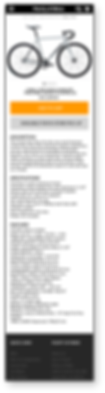
Home Page
Landing page for an e-commerce style page had to be clear with what was being sold so right off the first page was a categorization of different bicycle types that the company carries along with descriptions and a navigation bar follow through while scrolling to make sure users would be able to access any part of the site.
The background image represents both the moodboard tones of summer and cycling.
From a consumer standpoint it was important to showcase an image of the shop just to give users a grounded perspective of the style, vibe, atmosphere.
The shopping experience simplified with the latest stock to further avoid back and forth between in-stock and out-of-stock inventory.
Keeping returning users engaged with a section for add-on's and user specific parts.

Jumping right into the best selling categories of the shop right below the homepage banner gives users an immediate start into offerings.
Clear and straight to the first stage of purchasing any fitness equipment is the importance of testing before buying.
Finding the right 'type' of product within the customer's lifestyle / needs starts with sizing.
07
Main features that were changed between the redesign was the amount of clicks reduced in going back and forth between products and options to buy. Image placement made sense to have the product front and center with all the features listed on the side rather than having users scroll back and forth to see info and the image in their decision making process for purchase.

Mobile Responsive
Functionality across mobile platforms was highly prioritized as demographics for users shopping for products are split between desktop and mobile

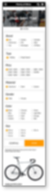
Filter Categories & Menu
The filters section needed to be integrated within the page and not as a separate standalone giving users options of specifying product search without being cluttered and overwhelming.
On of the main challenges was organizing the overall shopping menu and condensing to a more manageable set of areas without overwhelming users. Simplifying meant being able to have less clicks to get to the desired pages of interest.


Product Page
08
Conclusion
This project focused heavily on visually updating the current site’s aesthetic appearance to a more modern look. The redesigned elements helped in user acquisition as well as laying out information in a clean organized format. The way user’s would be able to easily browse through content was ultimately an important goal that I feel was accomplished with the redesign. Overall the redesign led to lower bounce rate’s and higher user engagement.