
MARINE DEPOT

UI / UX Case Study
I had a great opportunity working with one of the leading companies in aquarium e-commerce helping them scope
out and update their company’s online storefront.
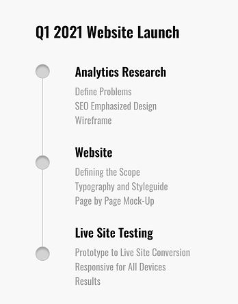
DEFINING THE SCOPE & PROBLEMS
The site that was originally designed in a period where major structures of websites were primarily desktop screen sizes and didn’t exactly cater to the primary audience the companies main body of customers eventually shifted to which is mobile. The team at MarineDepot and I got together to scope out the problems, inconsistencies, and improvements that could be made to make their storefront a smoother, updated experience.

HEATMAPS &
ANALYTICS RESEARCH
One of the target tools for content arrangement was studying user flows through heatmaps and analytics research. Analyzing a user journey throughout the years made it very clear which pages performed well and what areas of that specific page was engaged on the most.
After organizing all of the analytics and heat maps screenshots the problems became clear on which content per page needed changes.

ANALYZING
USER FLOWS
As the market for Aquarium Enthusiasts has risen over the years we realized our competitors have all made their efforts in updating their online presense so we broke down the stuff that worked and elements that could be improved. Analyzing drop-offs and solving UX problems per page gave us a better roadmap for element placement for wireframes.


WIREFRAME


WIREFRAME ITERATIONS
After going through the analytics data and organizing our problems/solutions, we went through a series of iterations as the information showed us the areas where our users were primarily interacting and areas we wanted improvements towards so everything from making our categories more lively, to a simpler filters section with eye catching call to actions were prioritized in placements.
DESIGN STYLE GUIDE

SCREENS
.png)


IMPROVEMENTS TO MOBILE SHOPPING
Understanding our target audience with both analytics data along with customer relation’s we sought to emphasize the overall shopping experience in navigation by eliminating any possible distractions and focusing attention towards primary call-to-actions (add to cart). The bounce rates seemed to show that users get distracted while on the final page before purchase which is a great thing for browsing multiple items but not when selecting a particular product.


NAVIGATION RE-STRUCTURE
Re-organizing and re-structuring the user navigation was key in balancing both SEO benefits while not overloading users causing drop-offs just based off having too many redundant options within categories. We found the best solution to retain what the site offers without compromising too much primarily based off user drop-offs.


CONCLUSION & METRICS
Working closely with front-end development led to modifying iterations based off screen size requirements with a soft launch for vendors to test the site’s overall performance. The site ended up being a success with clear data showing less drop-offs and longer time spent on pages both mobile and desktop. With this process I got a better understanding of sizing conversions used by different CSS frameworks and how to appropriately solve user problems without compromising too much of the original design aesthetic.
With the soft-launch we learned the biggest success came from the change in bounce rate percentages along with average time spent on improved sections almost double from the previous design. As the primary goal of this project was to have an increase in page viewing times overall it was a considered a success on that front.